Color is important. Psychologists have discovered that certain colors affect us in certain ways, and marketing experts have used that to their advantage. That is why banks use a lot of blue on their websites; it instills a sense of trust and calmness in us.
It is the reason McDonald’s picked red and yellow for its logo and why Home Depot decided to use orange in all of its marketing.
Each color in the spectrum affects the human brain differently, and learning how each color affects people can help you with your website conversions.
The use of certain colors can capture attention, while the use of others can keep people engaged. You can then hit them with a third color that encourages them to take action!
Using The Right Color In the Right Way
The psychology of color is a tricky thing. You have to use the right color in the right way, at the right time, with the right audience. For example, men don’t like purple and brown colors, So if your website is targeting men, then you have to stay away from these types of color combinations on your website. Instead of these color combinations, you can try Blue, Green, and Black Color.
My website uses a blue color to attract people., In color psychology, The color blue is a color of trust, peace, order, and loyalty. Choosing the right color will help t increase your website conversions, too.
Psychology Of Color
Here we are discussing the psychology of color and exactly how you can implement them to improve your conversions.
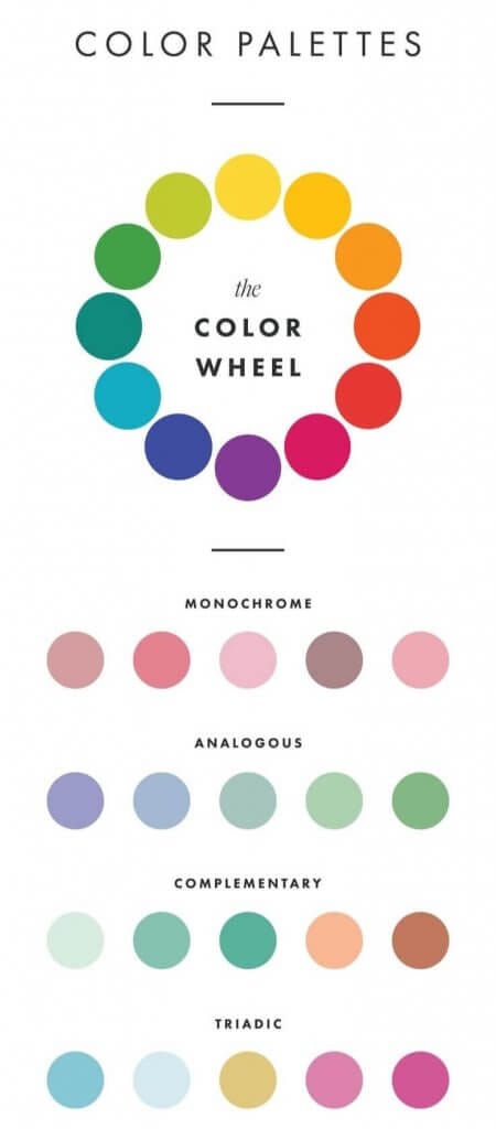
Color Tips That Will Improve Your Conversions
Green
Green symbolizes…green… Going green, to be precise. This color is associated with the Earth and all things that come from it. You will see a lot of it in garden centers, and not just because of all of the shrubs and trees.
Green is used in packaging to subconsciously alert you to the organic factor involved with a product or process.
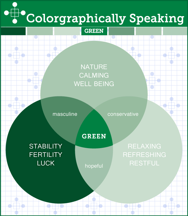
It is also suggested that green can spark creativity in people. So, not only should you use green on your landscaping website, but you should also feature the color prominently on your arts and crafts e-commerce store. The more creativity you can inspire, the more sales you can make.
It Is Easy Being Green
Subway and Whole Foods are companies that have successfully used the color green in their branding. As part of Subway’s efforts to “Eat Fresh,” people see the world’s largest franchise as a healthy alternative to typical fast food. Whole Foods has used the same concept, becoming the country’s #1 place to buy organic.
Be careful, though. Because it is the color of money, green is also the color of greed and jealousy.
Yellow
While some have said the color yellow makes people happy, this does not always seem to be the case. It is the color of caution, hence the use of it in street lights and signs, as well as wet floor signs.
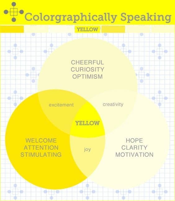
The color is also an identifier. People react in a store when they see yellow; they expect to see something on clearance. It is also the primary color used for highlighting text, either handwritten or on a computer screen.
Yellow is also energy and excitement. You should use this color in your call to action on your website. It will get your clients pumped up and ready to act!
Ronald McDonald Likes Yellow
Remember the call out to McDonald’s earlier? The yellow arches do not just signify the salty, golden fries that have helped make the company so famous. Yellow was chosen to steer people into their restaurants, like a beacon to those driving up and down America’s early highways.
Notice that it is not the primary color, though. You can do the same to generate conversions. Use the flashiness of the color to drive consumers to take action on your website.
Blue (Outside Of The US)
Blue is the most commonly used color in the world. In much of the Western world, the color blue is one of trust but also sadness and masculinity. In other parts of the world, it has different meanings. It can represent religious concepts such as immortality or heaven, while in China, it actually has feminine connotations.
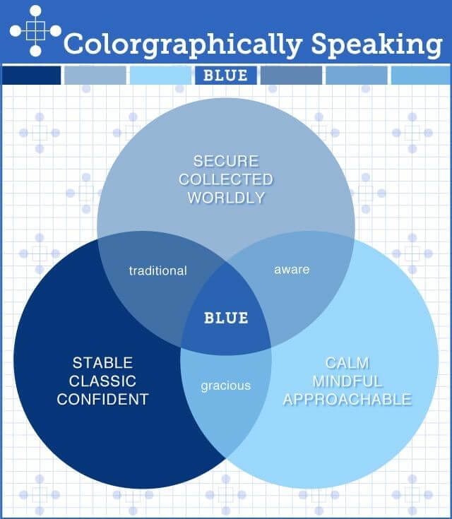
If your website is geared towards a global audience, then your best choice of colors to use is blue. Even with so many different meanings behind it, blue is considered by marketing experts to be the safest because it is rarely associated with anything too negative.
Pepsi VS Coke
Even though Coke has the hearts of the majority of the United States, it is Pepsi that dominates the majority of the world — and not because of its flavor. Because of their use of the color blue in their packaging and marketing, Pepsi has been accepted by many cultures of the five remaining continents (we’re not counting Antarctica here).
Coke, with its use of the harsh red color, met with resistance in much of the world. The flavor had nothing to do with the battle; psychology did. Keep this in mind as you redesign your website for foreign audiences.
Purple
In many different cultures, purple is the color of royalty. With royalty comes power and wealth. It represents courage and honor as well, the reason the color is used in the Purple Heart medal.
While men, in general, have been found to dislike purple, it is a preferred color among women — giving them that sense of strength and power, of royalty.
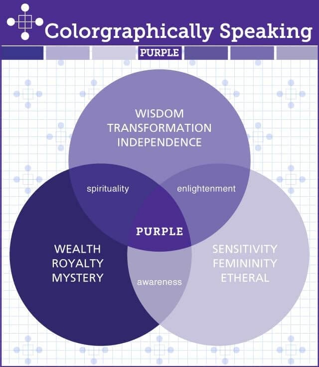
Avoid this color if your website is geared towards men. However, if you want to make it as appealing as possible to women, then use purple to keep them hooked.
Prime Examples Of Purple
Crown Royal is perhaps the best-known brand to use purple. The company’s use of the color in its logo and its packaging fit perfectly with its name, and the company has successfully made a name for itself among the various other whiskey brands.
A company that uses another aspect of purple is the Syfy Channel. The TV series the station airs can be from any number of genres with many unusual themes or elements in them.
The “outside the box” thinking the writers and directors employ helps subject matters that do not normally get explored appear on the TV or computer screen. The color helps the quirkiness and campiness of these shows and movies they produce to find an audience.
Monochrome
This term is typically referring to black-and-white (which includes shades of gray as well). The colors individually have different meanings. Black is associated with wealth and authority. That is why there are so many black vehicles on the roads, and why so many business suits are in this color.
Using black on your site can appeal to people who are or want to feel like they are part of the rich and powerful.
White, on the other hand, is an overly used background color and not really utilized as well as it could be. The color portrays a feeling of clean-and-crisp which is why professionals use it in their advertising or on walls. It is a sterile color that is often used to make another stand out.
Mix the two colors, and you have something else. The combination of black and white creates a classic feel, one of glamour and luxury, a timeless sense. If you want this feeling for your website, then a monochromatic scheme is what you need. Use some free black and white images on your website along with a single accent color to inspire elegance.
Authority And Luxury
CBS once prided itself on presenting news that was balanced and factual. To that end, the broadcasting company began using black-and-white in its logo to portray itself as the journalism expert viewers could trust.
This monochromatic color scheme, with its combination of authoritative black and clean white, gave information seekers a sense of trustworthiness.
The New York Times does the same with its use of black-and-white. Wikipedia presents itself in the same way. Even though the information on its website is user-generated and user-editable, and that information may oftentimes be inaccurate, the company has created the perception of credibility thanks to its use of black-and-white.
If you want visitors to your website to believe you are the authority in the industry you are involved in, black-and-white can help you with that — now you must prove it with the content on your site.
For classic luxury, look to the symbols of Honda and Mercedes-Benz. Both auto manufacturers use black-and-white (and gray or silver) to give their vehicles and their respective companies this perception.
Red
Red is the biggest call-to-action color. It is bold. It is blood. It is another color companies use to get you to stop (again, stop lights and stop signs) and look at what they are offering.
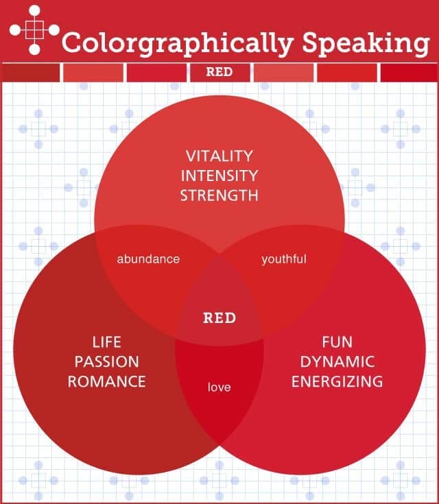
Against a clashing background, it can shout at clients to do what you want them to. And because it is an exciting color, a sense of urgency will spark them into action. Use this color wisely.
Do not over-inundate your website with this color. Too much can hurt the eyes and actually push people away from your site.
Bold Color For Big Names
Many big-name (and former big-name) companies have used red to portray a sense of excitement and boldness. Target, ACE Hardware, and K-Mart all use color to stand out against surrounding businesses and draw customers in.
This is especially the case with Target as its leading competitor, Walmart, relies heavily on blue in its stores and in its marketing. If your online business needs a color that stands out against the colors of your competition, then red is a great way to go.
Conclusion
The subconscious effect of color on our brains is something that marketing experts have been using for decades. Companies have expertly used it to create an appeal to their clientele that retains customers and draws new clients in.
More recently, these companies have begun using the psychology of colors to increase their website conversions. They continue to use color to portray themselves in a particular way and have mastered its use to generate the desired effect they want out of visitors to their websites.
If you want to improve your own website conversions, first consider what mood or emotion you want to convey. Then, without overdoing it, use that color or combination of colors to convince people to click that “Yes” button!
very helpful post. Thanks For sharing. keep up the good work
Excellent outline on color psychology for boosting website conversions. The detailed breakdown of each color’s impact and their proper usage is greatly helpful. Especially, the examples given provide a better understanding.
I found this article extremely beneficial! The detailed interpretation of how each colour impacts our psychology and conversion rates was truly enlightening. Now, I have a clearer understanding of how to utilize these colours effectively for my website. Great job!