
TL;DR: Color contrast is the brightness difference between your text and its background. WCAG 2.2 requires a minimum 4.5:1 ratio for normal text and 3:1 for large text to pass Level AA compliance. As of 2026, 83.6% of websites fail these standards (WebAIM Million 2024), and ADA-related lawsuits hit 4,605 in 2024. Below, I’ll show you exactly how to check, fix, and maintain proper contrast on your website.
What Is Color Contrast (and Why Does It Actually Matter)?
Color contrast is simply the difference in brightness and hue between two colors — usually your text and its background. Black text on a white background? That’s a 21:1 contrast ratio, the highest possible. Light gray text on a white background? That’s maybe 2:1, and your visitors are squinting.
I’ll be honest — when I first started building websites, color contrast was the last thing on my mind. I was too busy picking “aesthetically pleasing” color palettes. Soft gray text on a cream background looked elegant to me, but I didn’t realize I was making my content unreadable for millions of people.

Here’s the reality: 26% of adults in the United States have some form of disability, according to the CDC. About 1 in 12 men and 1 in 200 women have some form of color vision deficiency (commonly called “color blindness”). That’s roughly 300 million people worldwide.
If your website’s text doesn’t stand out clearly from its background, you’re not just creating a bad user experience — you’re actively shutting out a massive portion of your potential audience. And yes, it also impacts your visual optimization and SEO rankings, which I’ll cover below.
What Are the WCAG Color Contrast Requirements?
The Web Content Accessibility Guidelines (WCAG) 2.2 — maintained by the W3C — are the global standard for web accessibility. When it comes to color contrast, WCAG defines two compliance levels: AA (the minimum you should aim for) and AAA (the gold standard).
Here’s what the numbers actually mean:
| Element | WCAG AA (Minimum) | WCAG AAA (Enhanced) |
|---|---|---|
| Normal text (under 18pt / 24px) | 4.5:1 | 7:1 |
| Large text (18pt+ or 14pt bold) | 3:1 | 4.5:1 |
| UI components & graphics | 3:1 | 3:1 |
| Logos & decorative text | No requirement | No requirement |
“Large text” means 18pt (24px) or larger for regular weight, or 14pt (approximately 18.66px) or larger for bold. This is important because large text gets a slightly relaxed requirement of 3:1 instead of 4.5:1.
A few exceptions where contrast requirements don’t apply:
- Logos and brand names — your logo text doesn’t need to meet contrast ratios
- Purely decorative text — text that serves no functional purpose
- Disabled/inactive UI elements — grayed-out buttons, for example
- Incidental text — text in photographs or screenshots that isn’t critical content
If you’re just getting started with website accessibility, aim for WCAG AA first. It’s the standard most laws reference and covers the vast majority of your users. Want to go deeper into making your site user-friendly? Check out my WordPress tutorial for beginners for more foundational tips.
How Poor Contrast Actually Hurts Your Website
Poor color contrast isn’t just an accessibility “nice-to-have.” It directly impacts your traffic, legal exposure, and revenue. Let me break down the real costs.
You’re Losing Visitors (and Don’t Even Know It)
According to the WebAIM Million 2024 report, 83.6% of the top 1,000,000 website homepages had detectable WCAG failures — and low-contrast text was the single most common issue, found on 81% of pages.
That means 4 out of 5 websites have text that some visitors literally cannot read. These visitors don’t file a complaint — they just leave. And your analytics shows them as a “bounce,” not as an accessibility failure.

Legal Risk Is Real (and Growing)
This isn’t theoretical. In the US, 4,605 ADA Title III lawsuits were filed in 2024, according to Seyfarth Shaw’s annual study. Settlements typically range from $25,000 to $75,000, and that doesn’t include legal fees.
In Europe, the European Accessibility Act (EAA) took effect in June 2025, with penalties reaching €100,000 or 4% of annual revenue. If your website serves EU customers, you’re now required to meet WCAG 2.1 AA standards — and color contrast is the first thing auditors check.
It Impacts Your SEO and Conversions Too
Google’s page experience signals include accessibility factors. While Google hasn’t made WCAG compliance a direct ranking factor, Core Web Vitals and user experience metrics (bounce rate, time on page, engagement) are heavily influenced by readability.
A site with poor contrast has higher bounce rates and lower engagement — both of which hurt rankings. On the flip side, studies show that websites with proper contrast see up to 27% higher conversion rates compared to those with accessibility issues. If you’re working on making your WordPress site faster, don’t forget that readability matters just as much as speed.
How to Check Your Website’s Color Contrast
Before you fix anything, you need to know what’s broken. Here are the tools I personally use to audit contrast — all of them are either free or have generous free tiers.
1. Chrome DevTools (Free and Built-In)
This is my go-to for quick checks. You don’t need to install anything — it’s already in your browser.
Here’s how to use it:
- Right-click any text element on your page and select Inspect
- In the Styles panel, click the small color square next to any
colorproperty - The color picker opens with a contrast ratio displayed at the bottom
- It shows whether the ratio passes AA and AAA with checkmarks or warnings
- You can also run a full accessibility audit: open DevTools → Lighthouse tab → check “Accessibility” → click “Analyze page load”
Chrome DevTools even suggests better colors when your current combination fails. It’s genuinely one of the most underrated accessibility tools available.
2. WebAIM Contrast Checker
WebAIM’s Contrast Checker is the industry standard. It’s simple, fast, and gives you an instant pass/fail for both AA and AAA levels.
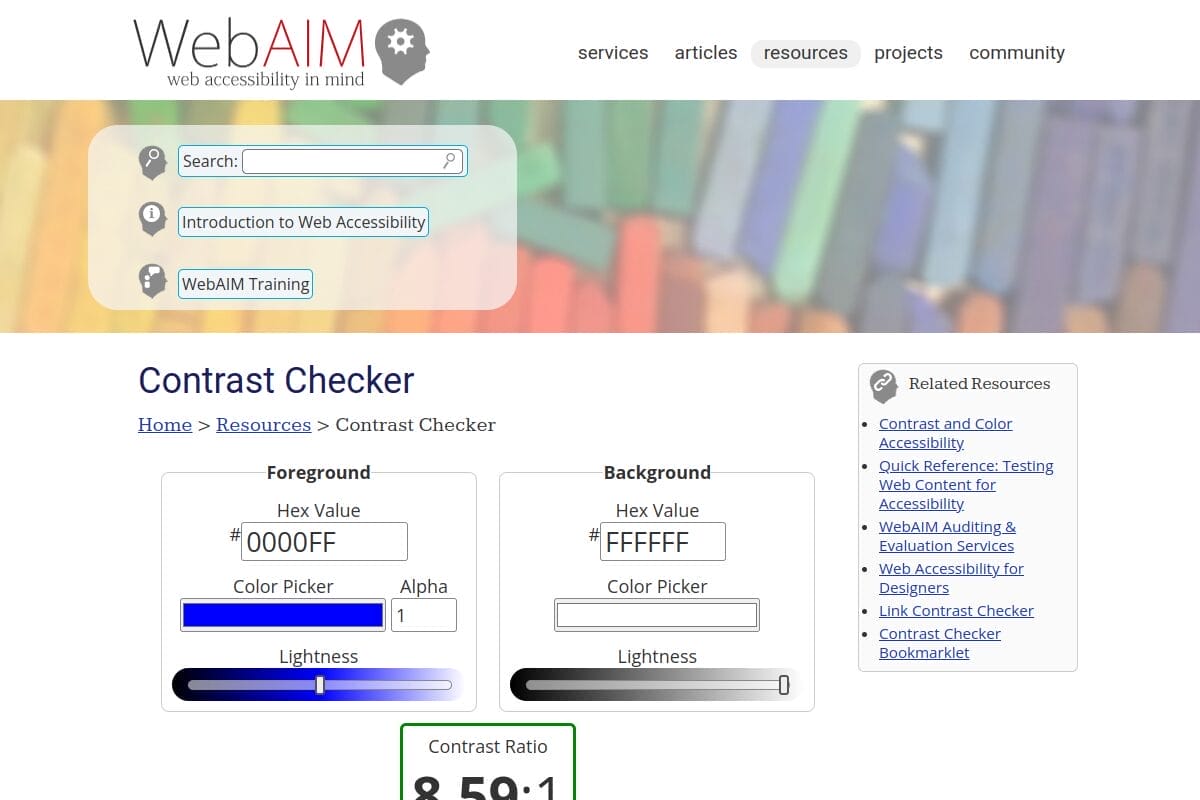
Just enter your foreground (text) color and background color as hex codes, and it instantly calculates the ratio. I check every new color combination against this tool before deploying it on any of my sites.
3. Coolors Contrast Checker
Coolors is primarily a palette generator, but its contrast checker is excellent. It provides a real-time preview of how your text looks against the background — much more visual than WebAIM’s number-only approach.
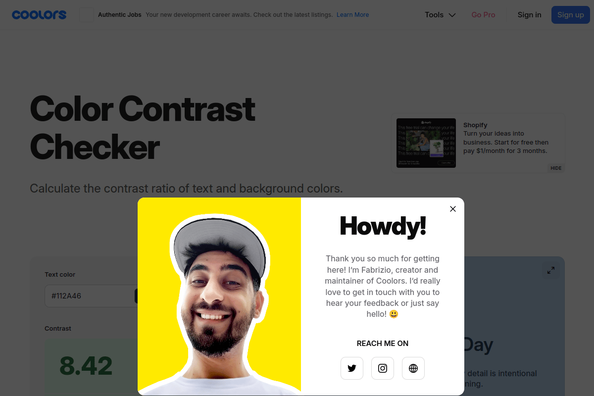
I especially like Coolors when I’m exploring new color schemes, because you can tweak colors with sliders and see the contrast ratio update in real time.
4. WAVE Browser Extension
WAVE (also from WebAIM) is a free browser extension for Chrome, Firefox, and Edge. Unlike the contrast checker above, WAVE scans your entire page and highlights every single contrast failure visually — right on the page itself.
It’s the fastest way to get a full accessibility audit of any page. I run WAVE on every article I publish.
5. Stark (For Designers Using Figma or Sketch)
If you design in Figma, Sketch, or Adobe XD, Stark is a plugin that checks contrast directly inside your design tool. It catches accessibility issues before they ever make it to code, which saves a ton of rework later.
Stark also simulates different types of color blindness (protanopia, deuteranopia, tritanopia) so you can see how your design looks to users with color vision deficiencies.
How to Fix Color Contrast Issues on Your Website
Found some contrast failures? Here’s how to fix them, step by step.
Step 1: Audit and List Every Failing Element
Run WAVE or Chrome Lighthouse on your most important pages (homepage, top landing pages, blog posts). Write down every element that fails — text, buttons, links, placeholders, icon labels. You need a clear list before you start changing things.
Step 2: Choose WCAG-Compliant Color Replacements
For each failing element, use WebAIM’s contrast checker to find a darker or lighter shade that passes 4.5:1. Small adjustments often work — going from #767676 (4.48:1, fails) to #757575 (4.6:1, passes) keeps the same visual feel while hitting compliance.
Step 3: Update Your WordPress Theme
In WordPress, most contrast issues come from your theme’s default colors. Here’s where to fix them:
- Theme Customizer (
Appearance → Customize) — look for “Colors” or “Typography” sections and update text, heading, and link colors - Full Site Editor (block themes) — go to
Appearance → Editor → Styles → Colorsand update your global color palette - Custom CSS — add targeted overrides in
Appearance → Customize → Additional CSS:
/* Fix body text contrast */
body, p, li { color: #333333; }

/* Fix link contrast */
a { color: #0056b3; }

/* Fix placeholder text contrast */
input::placeholder { color: #595959; }
If you’re also looking to improve your site’s typography beyond just color, check out my guide on the best fonts for WordPress — font weight and size directly affect contrast perception.
Step 4: Don’t Forget These Commonly Missed Elements
Most people fix body text and call it done, but these elements fail just as often:
- Form placeholder text — browsers default to light gray, which almost always fails
- Footer text — often light text on a slightly darker background, just barely failing
- Button text — especially “ghost” buttons with thin borders and light text
- Navigation links — hover and active states need contrast too
- Icon labels and colors — if you use FontAwesome or similar icon fonts, make sure icon colors meet contrast requirements too. Here’s how to change FontAwesome icon colors in WordPress
- Breadcrumbs and metadata — dates, categories, author names in small, light text
- Error messages and form validation — red on white might fail for some shades of red
Step 5: Test Across Devices and Conditions
Colors look different on every screen. What passes on your calibrated desktop monitor might fail on a phone screen in sunlight. Test on at least 2-3 different devices and consider that many users browse with reduced brightness or night mode enabled.
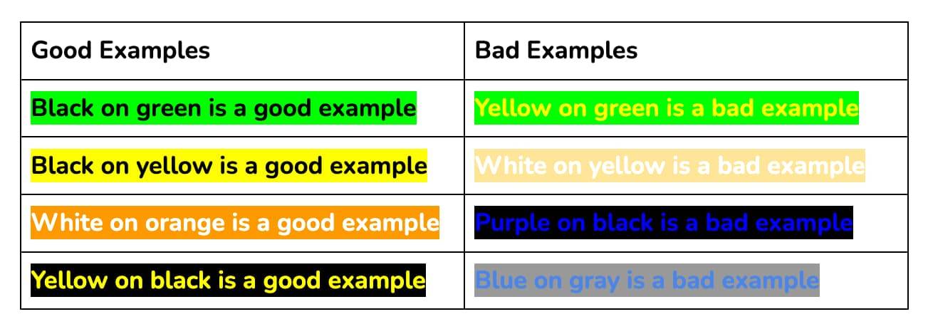
Color Combinations That Pass WCAG AA (Quick Reference)
If you want safe, proven color pairs, here’s a quick reference table. All of these pass WCAG AA for normal text (4.5:1 or higher):
| Text Color | Background Color | Contrast Ratio | Best For |
|---|---|---|---|
| #000000 (Black) | #FFFFFF (White) | 21:1 | Body text, headings |
| #333333 (Dark gray) | #FFFFFF (White) | 12.63:1 | Body text (softer look) |
| #FFFFFF (White) | #0056b3 (Blue) | 7.21:1 | Buttons, CTAs |
| #1a1a2e (Dark navy) | #e8e8e8 (Light gray) | 13.8:1 | Content sections |
| #FFFFFF (White) | #2d6a4f (Green) | 5.81:1 | Success messages |
| #FFFFFF (White) | #c92a2a (Red) | 5.57:1 | Error messages, alerts |
| #1a1a1a (Near-black) | #f8f9fa (Off-white) | 18.3:1 | Blog/article content |
| #FFFFFF (White) | #495057 (Medium gray) | 7.81:1 | Badges, secondary buttons |
Quick Tip: When in doubt, use darker text on lighter backgrounds. The “dark on light” approach naturally produces higher contrast ratios and is easier to read for the majority of users. If you’re working with colored backgrounds, always verify with a contrast checker — your eyes can deceive you.
Summing Up!
Color contrast is one of those things that’s incredibly easy to get right once you know the numbers. The core rule is simple: 4.5:1 for normal text, 3:1 for large text. Check your site with WebAIM or Chrome DevTools, fix the failing elements, and you’re done.
With 83.6% of websites still failing basic contrast standards and ADA lawsuits climbing every year, getting this right puts you ahead of the vast majority of the web. It’s a 30-minute fix that protects you legally, improves your conversions, and — most importantly — makes your content readable for everyone.
Start with the WAVE browser extension. Run it on your homepage right now. You might be surprised what it finds.