Are you looking for the best fonts for your WordPress website, but with so many options out there, you’re too confused to pick the one that can enhance the overall look of your website? I have created hundreds of websites in my life, and believe me, I have also gone through this phase.
And as we know, content is king, but the importance of good typography cannot be overstated. If you’re using the correct font choice on your website, you can significantly improve your website’s overall appearance, readability, and user experience.
Moreover, suitable WordPress font also has an impact on SEO. SEO is majorly impacted by two factors, i.e., bounce rate and dwell time, and using the correct font can help to improve both. So, not only does a great font make your site look good, but it can also help it perform better in search engine rankings.
Based on this, and personally testing hundreds of typography fonts for the website, I am with another incredible post related to “Best Fonts for WordPress Website.” In this guide, I’ll share the list of 11 best fonts with you and the ones I prefer using on my website. Therefore, let’s jump into the world of best fonts without further ado.
Top Fonts for WordPress Website
There are many fonts in the market, but choosing the right one is a task. The correct font can help you to make your content appealing. Hence, with that in mind, I am sharing my all-time favorite fonts, which I currently use on my websites.
1. Sofia Pro (Paid)
This font, created by Oliver Gourvat in 2009, features geometric shapes and smooth curves. It is one of the most popular fonts among graphic designers, and I also use it for most of my websites.
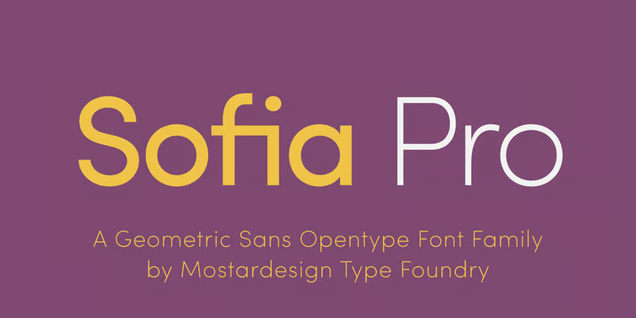
Its smooth curves and geometric shapes showcasing open terminals make it readable even at small sizes. Also, it offers eight different weights, including Ultra Light, Extra Light, Light, Regular, Medium, Semi Bold, Bold, and Black, each with corresponding italics. You can use this font for many things, like headings, sub-titles, signage, logos, etc.
The most commendable feature of the font is that it supports more than 130 languages, making it an ideal choice for global brands and international projects. You can buy this font from Adobe Fonts, or if you have an Adobe Creative Cloud account, you can use Sofia Pro font for web design and print projects through Adobe Activate.
Highlights:
- It belongs to the geometric sans typeface family.
- Glyphs available for this font include Latin Lowercase, Latin Uppercase, Numbers, Common Latin, and Punctuation.
- This font supports more than 130 languages of Eastern Europe, Greek, Western Europe, Central Europe, and Cyrill to smooth the process of international communication.
- Navigo Thin, Ainslie Sans Norm Light Ital, Navigo Extralight, and Neuzit Grotesk Regular fonts resemble Sofia Pro.
Sofia Pro can be paired with Proxima Nova Regular, Temeraire Regular, Komet ExtraLight Sc, Roma Gothic M Semibold, FreightSansCndPro Book, and Tisa Pro Regular.
2. Montserrat (Free)
Another font that I widely use in WordPress is Montserrat. This font was designed by Julieta Ulanovsky in 2010 by taking inspiration from the Montserrat neighborhood and typographical posters from the 1920s. This font is prevalent among graphic designers and digital marketers.
Moreover, this font boasts supporting languages, including Latin-based languages such as English, Spanish, French, German, Italian, Portuguese, and many others, making it suitable for multi-lingual or global projects.
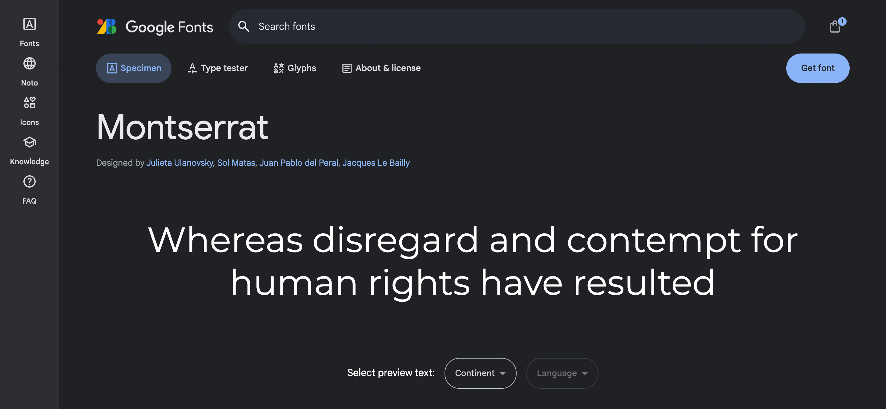
The most outstanding feature of this font is its versatility, which means it comes in various versions that allow the designers to choose from different weights and styles. Further, this font features a sleek and contemporary appearance, giving it a timeless quality. Its clean lines and geometric shapes make it visually appealing and suitable for various design styles.
You can freely download this font’s regular version and other versions from Google Fonts, Dafont, Font River, and Font Freak. These resources provide a vast collection of this font, which will aid you in making your blogs or presentations more legible.
Highlights:
- Montserrat font belongs to the sans-serif typeface.
- Glyphs available for this font include Latin Lowercase, Latin Uppercase, Latin, Cyrillic Lowercase, Cyrillic Uppercase, Numbers, Common Latin, Punctuation, Currency Symbols, and Marks.
- This font supports 494 languages from different countries, including 97 languages from Africa, 141 from America, 85 from Asia, 147 from Europe, and 24 from Oceania.
- This font is mainly used in the United States, Russia, and Mexico.
- The fonts that look similar to Monteserrat are OmnesCyrillic Thin, Raleway ExtraLight, Fieldwork Hum Hair, OmnesCyrillic Thin Italic, Proxima Nova Black Italic, URW From Expand Heavy Italic, and OmnesCyrillic Extra Light Italic.
Montserrat can be paired with Mortise X-Light, Halmoc Italic, Forma DJR Micro Medium, Natura Regular, Bebas Neue Regular, Obvia Expanded Light, Bio Sans Italic, and Fantabular Sans MVB Regular.
3. Roboto (Free)
I use this font to attract a large audience, as it is very visually appealing. And guess what? You always see this font. Wondering how?
Christian Robertson initially designed this font for Android devices and other Google services. So, you can imagine how legible this font is. This font comes in six weights and includes Roman and oblique. This font has undergone several modifications from time to time; in 2011, it adopted the use of round dots, round without straight segments, straight-legged ‘R,’ and ‘kK’ characters without a horizontal, making it more understandable.
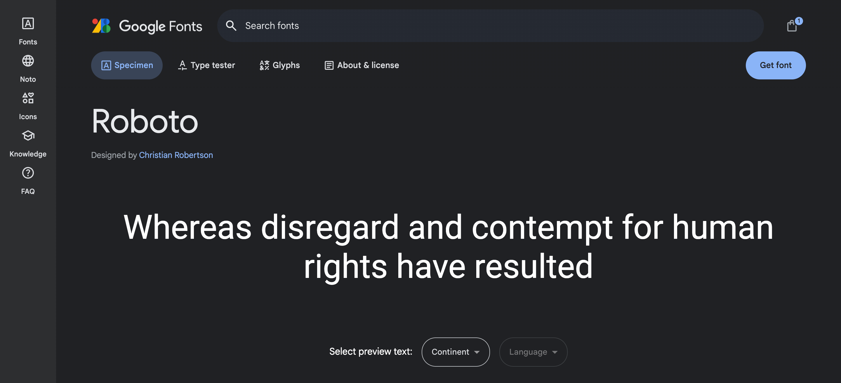
Further, in 2021, it underwent modification and launched as Robo Flex, making it more desirable. Roboto Flex is intended to be a variable typeface, which means that it may be altered along several parametric axes to provide a variety of weights, grades, widths, and optical sizes.
This font also supports various languages like ( Vietnamese), Greek, and Cyrillic. Also, there is a Roboto called Heebo, which includes Hebrew characters to cater to Hebrew typography. This font is freely available on Google Fonts.
Highlights:
- Roboto belongs to a sans-serif typeface family, showcasing friendly and open curves.
- Glyphs available for this font include Latin Lowercase, Latin Uppercase, Greek Lowercase, Greek Uppercase, Cyrillic Lowercase, Cyrillic Uppercase, Currency Symbols, Numbers, Common Latin, Punctuation, and Marks.
- This font supports 311 languages from different countries, including 76 languages from Africa, 34 from America, 60 from Asia, 121 from Europe, and 20 from Oceania.
- This font is mainly used in the United States, followed by Russia and Turkey.
Heebo Light, Heebo Regular, Heebo Thin, Heebo Medium, Bio Sans ExtraLight Italic, Calling Code Regular, Calling Code Italic, and Acumin Pro Bold Italic are some of the fonts that look similar to Roboto.
4. Lato (Free)
Lato is one of the most widely used fonts for the WordPress. Its round edges and approachable appearance make it one of the best fonts to use in WordPress. Łukasz Dziedzic launched this font in 2010 since it is the favorite font of most users.
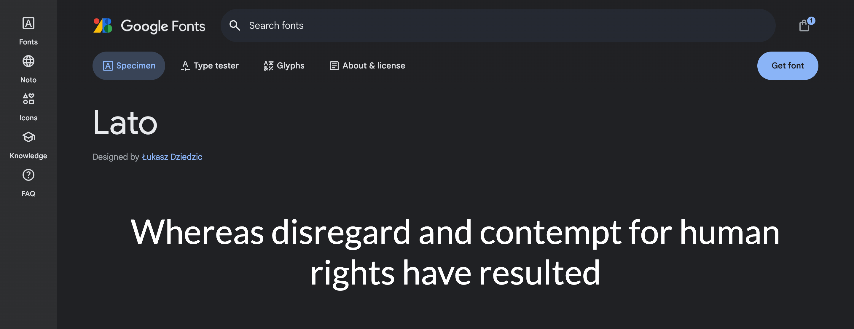
This font offers eighteen styles and nine different weights, each with nearly 3000 glyphs, making it versatile and flexible for typography. The weight ranges from hairline to black, allowing you to choose according to your needs. I use this font when I want to attract an audience through headlines.
The font is not only widely used in WordPress but for various other platforms as well, like magazines, promotional items, websites, and business cards. This font has gained popularity mainly because of its neatness and clarity, making it an ideal choice for delivering important information that will leave a long-lasting impression on the audience.
This font also supports all Latin alphabets, including Cyrillic, Greek, and IPA. After the launch of this font, it has become the third most widely served font on Google Fonts, with over 1 billion views per day. If you want to use this font for WordPress, you can download it free from Google Fonts.
Highlights:
- This font belongs to the sans serif typeface family.
- Glyphs available for this font include Latin Lowercase, Latin Uppercase, Numbers, Common Latin, and Punctuation.
- Lato can support 339 languages from different countries, including 78 languages from Africa, 126 from America, 53 from Asia, 67 from Europe, and 15 from Oceania.
- This font is mainly used in the United States, followed by Turkey.
- FreightSansHPro Hairline, Source Sans Pro Semibold, Fira Sans Italic, Liberated Thin, and STIX Two Text Regular are some fonts that look similar to Lato.
Lato font can be paired with STIX Two Text Regular, Krete Regular, P22 Mackinac Pro Book, and Rival Sans Narrow Light.
5. Open Sans (Free)
The following font on my list is Open Sans for your WordPress account. It is the simplest yet best font you can use in WordPress. It is one of the popular fonts used because of its clean structure and modern design.
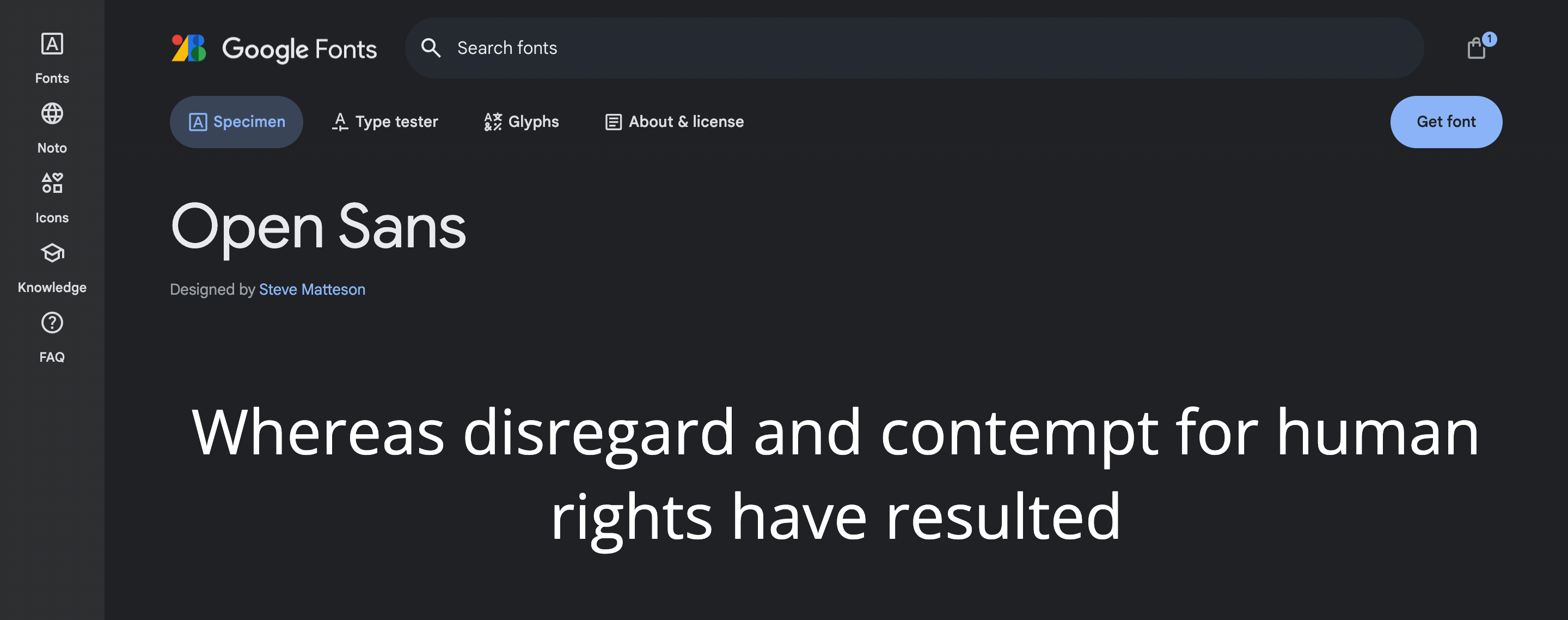
The most exciting feature of this font is its open and rounded letter forms, making it easy to read and understand even in small sizes. This feature makes this font widely used for mobile interfaces, body text in websites, and other digital interfaces. I have been using this font for several years on WordPress, and this font has always kept me from being down.
The extensive language support of Open Sans is another benefit that forces me to use this font in various projects. It is appropriate for projects involving several languages since it features a wide variety of Latin-based characters. Additionally, the typeface is compatible with many diacritical markings and special characters, guaranteeing accurate typographic representation for many languages.
Apart from that, Open Sans is a web font that allows it to be easily embedded into websites using CSS. You can download this font freely from Google Fonts, which launched this font under the Apache License, making it accessible to everyone.
Highlights:
- Steve Matteson designed Open Sans, which belongs to the sans serif typeface, having an 897-character set.
- Glyphs available for this font include Latin Lowercase, Latin Uppercase, Greek Uppercase, Greek Lowercase, Cyrillic Lowercase, Cyrillic Uppercase, Hebrew, Currency Symbols, Numbers, Common Latin, Punctuation, and Marks.
- This font supports 488 languages from different countries, including 96 languages from Africa, 140 from America, 83 from Asia, 147 from Europe, and 22 from Oceania.
- This font is mainly used in the United States, followed by Russia.
- Noto Sans Bold, Noto Sans Black Italic, Noto Sans Regular, Noto Sans Bold, and Noto Sans ExtraCondensed Bold are some fonts that look similar to Open Sans.
- Opens Sans pairing looks good with Proxima Soft Extrabold, Kandin Light, Adelle Condensed Light, Work Sans Light, and LavingeDisplay Regular.
6. Lora (Free)
If you want an elegant look for your WordPress, this font is for you. This modern style font combines contemporary and traditional elements. This font is perfect for everything, whether it is WordPress or digital design.
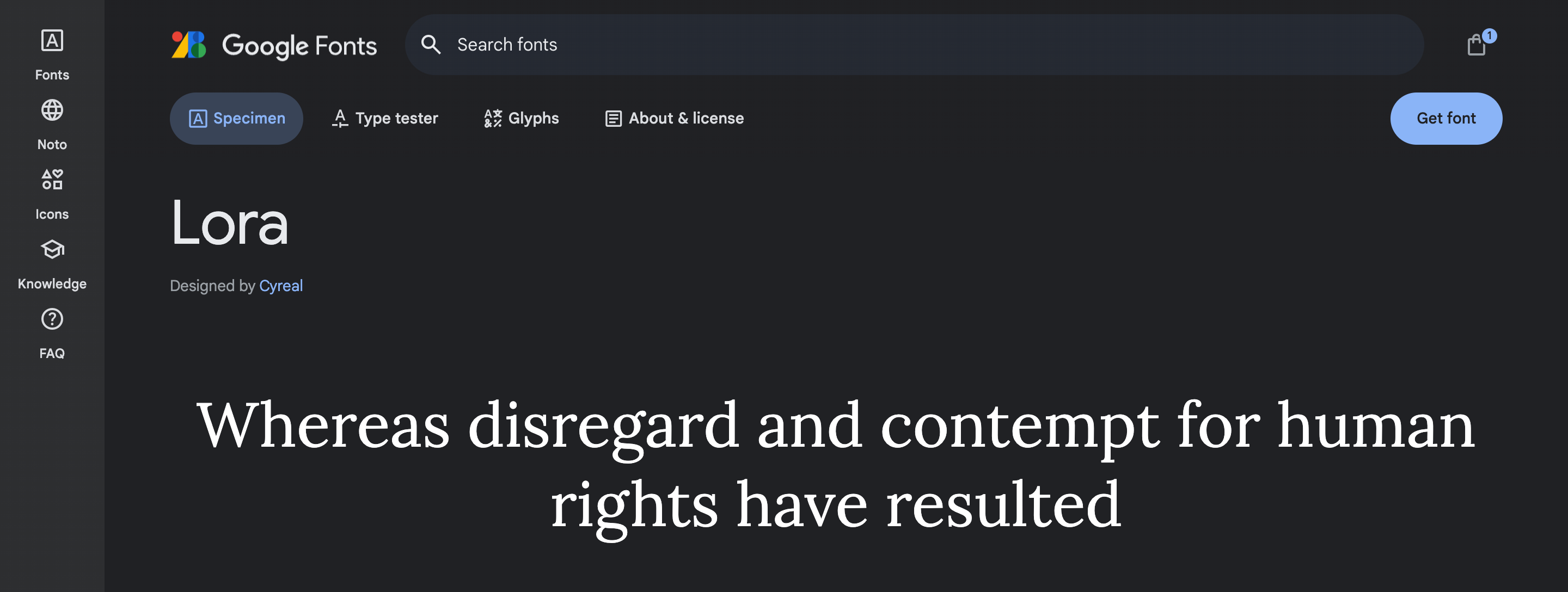
The distinct feature of this font is its irregular brush strokes, particularly in the serifs, that give it a unique and artistic flair. I prefer this font because it provides an eye-catching and dynamic look, making it the best choice for screen display, and it also adds a touch of elegance to any of my designs. This font’s broader and narrower sections provide a visually engaging appearance to my blogs, and its straight lines make it more legible even when used in longer texts.
If I want to post a longer text, then I consider this font because it doesn’t create any type of stress on the reader’s eye. This font has also undergone many modifications since its release. This font family consists of 8 styles ranging from the classic Lora Regular to bold and expressive Lora Bold.
Moreover, this font supports languages like Latin (Basic Latin, Western European, Central European, South Eastern European), Cyrillic (Russian, Ukrainian, Bulgarian, Serbian, Macedonian), Greek, and Vietnamese. This font is freely accessible under the Open Font Licence (OFL), and you can use it for commercial and non-commercial purposes.
Highlights:
- Lora font belongs to the serif typeface, having roots in calligraphy.
- Glyphs available for this font include Latin Lowercase, Latin Uppercase, Cyrillic Lowercase, Cyrillic Uppercase, Currency Symbols, Numbers, Common Latin, and Punctuation.
- This font supports 311 languages from different countries, including 75 languages from Africa, 35 from America, 60 from Asia, 119 from Europe, and 22 from Oceania.
- This font is mainly used in the United States and Russia.
Tzimmes Bold, Utopia Std Regular, Abril Titling Narrow Bold Italic, Soltias Serif, and Norm Medium It are the fonts that look similar to Lora.
7. Poppins (Free)
Poppins is among bloggers’ most popular fonts on their WordPress websites. This font provides a clean and aesthetic look to your texts with many modern and unique geometric shapes and supports different types of Unicode, including Latin, UTF-8, etc. I run a few blogs related to programming and technology, using this font to attract viewers.
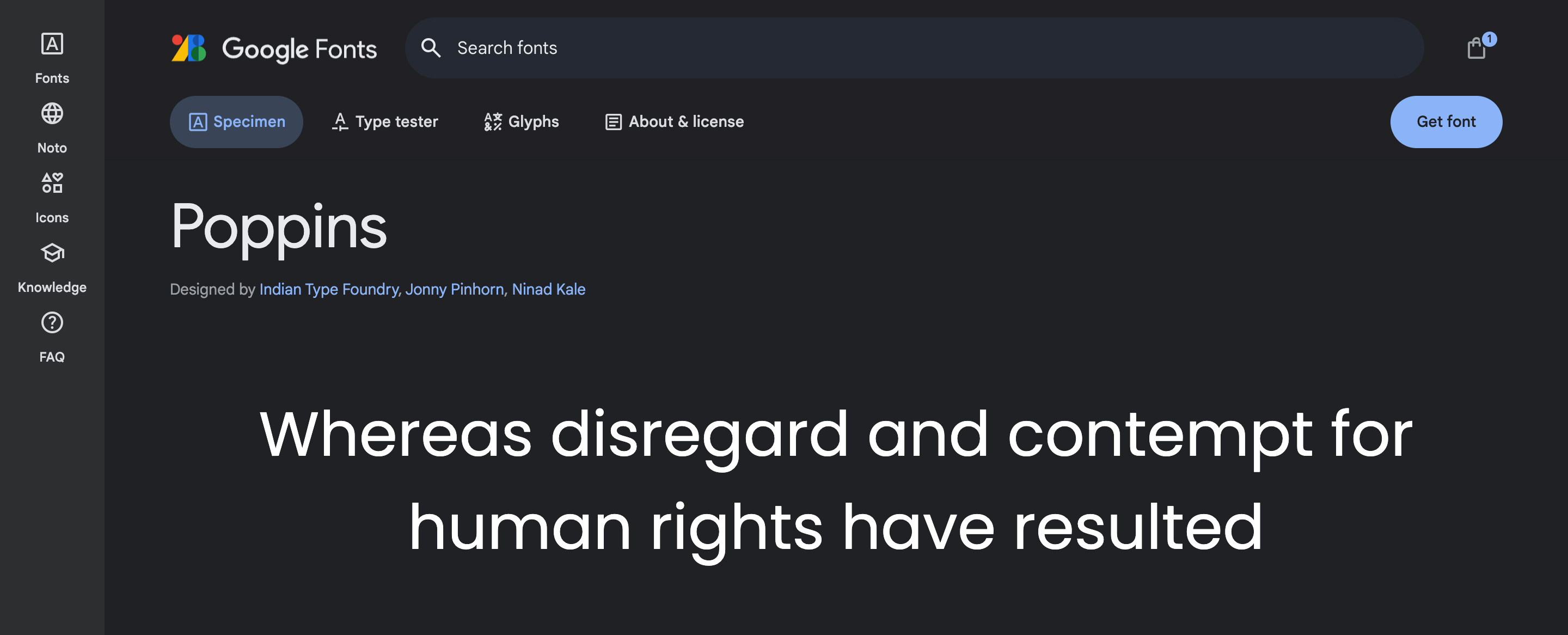
The best thing I found about this font is its clean and minimalist design, with unique geometric shapes and structures. I have used this font in running texts and large headlines, and believe me when I say this: this font can do wonders with your blogs. This font allows you to choose from nine different styles, allowing you to choose according to your requirements.
This font provides a balance between simplicity and visual interest, and I am the one who loves minimalist yet best. So, it won’t be wrong to say that this font is one of my favorite fonts. The font’s letters are designed so sophisticatedly that you can easily observe its smooth curvatures.
The font was designed by an Indian designer, Satya Rajpurohit, and a Netherland designer, Peter Bil’ak, by taking inspiration from ancient Greek letterforms. This font supports Latin and Devnagari languages. Also, you can download this font for free from Google Fonts, Dafont, Font Squirrel, and 1001 Fonts.
Highlights:
- Poppins Font is one of its type supporting Devnagri and Latin writing systems.
- It belongs to Geometric sans serif typefaces.
- Glyphs available for this font include Latin Lowercase, Latin Uppercase, Devnagri, Numbers, Common Latin, Punctuation, Currency Symbols, and Marks.
- This font supports 244 languages from different countries, including 68 languages from Africa, 31 from America, 51 from Asia, 73 from Europe, and 21 from Oceania.
- This font is mainly used in the United States, followed by Turkey and Poland.
- Urbane Bold, ITC Avant Garde Gothic Pro Book, Neuzeit Grotesk Bold, Urbane Bold Italic, Nort Thin Italic, Acumin Pro Bold Italic, BC Novatica CYR Medium, Neue Haas Grotesk Display 4, Forma DJR Display Light and Korolev Thin are fonts that resemble Poppins.
Poppins can be paired with fonts like Noto Sans CJK KR DemiLight, Interstate Regular, Komet ExtraLight SC, ITCFranklinGothic LT Pro CnBk, Halcom Italic, Form DJR Micro Medium, DIN 2014 Extra Bold, IvyMode SemiBold, and Tablet Gothic Oblique.
8. Nunito (Free)
If you are regular to my posts, then you must be aware of how big a fan I am of this font. This font gives my blogs a different, exceptional look, forcing me to use this font often. This font’s smooth curves and sleek design are what I love the most about this font.
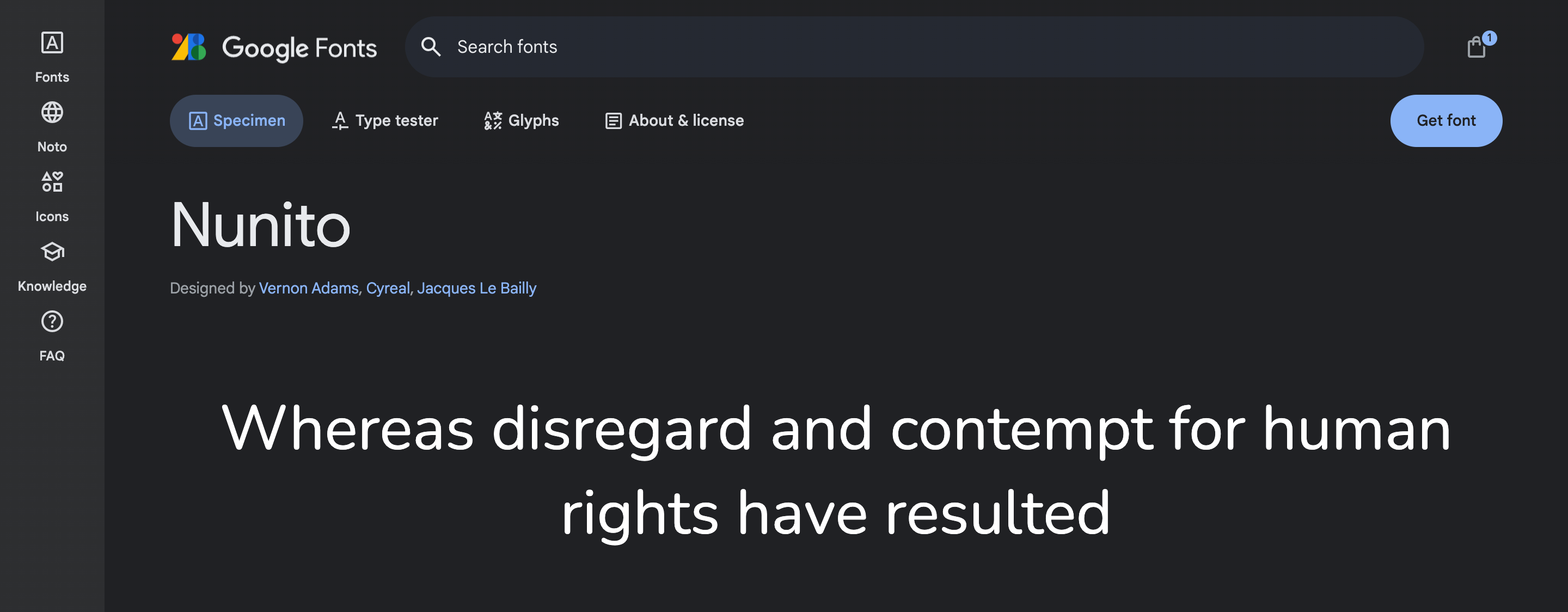
This font has outstanding features, like its extensive character set that includes lowercase and uppercase letters, punctuation marks, ligatures, multilingual support, and numbers. This feature allows me to use this font to create text in different languages, and I can easily accommodate various typographic needs.
I prefer to use this font when I want to make a bold statement that can leave a long-lasting impact on the audience; the uppercase letters of this font help me to do that. Another thing that is worth mentioning is that it provides improved spacing and kerning.
Overall, whether you’re working on a project requiring a bold statement headline or more flexible use of lowercase letters, Nunito font has got you covered. You can download this font freely from Google Fonts, Font Squirrel, and Dafont Free.
Highlights:
- It belongs to the sans serif typeface superfamily.
- Various glyphs are available, such as Latin Lowercase, Latin Uppercase, Latin, Cyrillic Lowercase, Cyrillic Uppercase, Numbers, Common Latin, Punctuation, Currency Symbols, Marks, etc.
- This font supports 501 languages from different countries, including 105 languages from Africa, 141 from America, 85 from Asia, 146 from Europe, and 24 from Oceania.
- This font is widely used in Vietnam and the United States.
- Some fonts like Nunito Sans ExtraLight, Nunito Sans ExtraLight Italic, Proxima Soft Bold, Proxima Soft Semibold, and Dita Regular resemble Nunito Font.
- Nunito Font can be paired with Yrsa Bold, Noto Sans CJK KR DemiLight, Asap Medium, Zeitung Pro Regular, Mrs Eaves XL Serif Nar OT Reg, Bennet Banner Black, Social Gothic Demibold, URW Antiqua Medium, Rama Gothic E Thin, and Essonnes Headline Bold.
9. Oswald (Free)
Oswald is another font I mainly advise using in a WordPress account. This font was designed by Vernon Adams from the United Kingdom and was released in 2011. This font’s clean and minimalist features make it the perfect font for every WordPress blog.
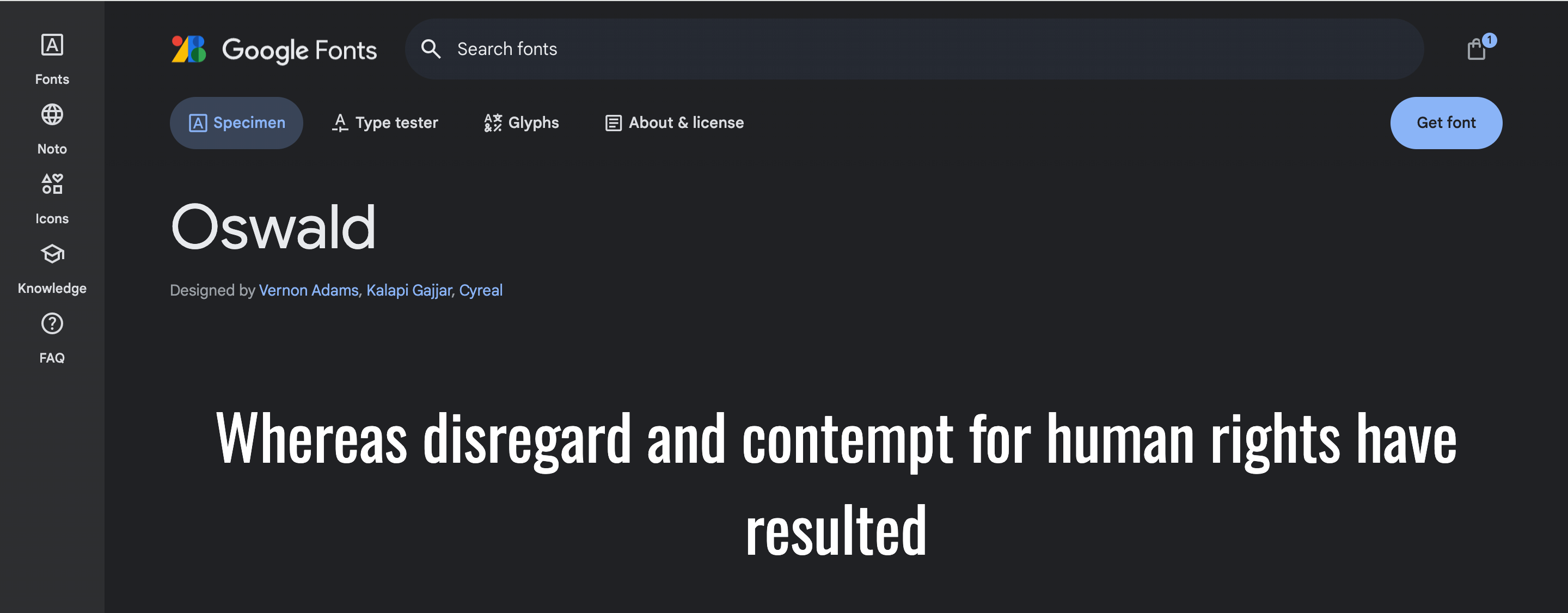
This font comes in a family of sans-serif fonts, making it suitable for various design projects. What I like best about this font is its level of legibility, i.e., you can read everything clearly, even at smaller sizes. Moreover, the font’s proportions are balanced carefully, with slightly condensed letterforms, giving it a compact and modern look.
The font is available in various weights, giving me an option to choose according to my requirements. Oswald is one of the most highly versatile fonts I know. It allows you to effortlessly use it in different projects, including branding, advertising, web design, and layouts.
Last but not least, this font supports multiple languages like English, Spanish, French, German, and many more. This font is available for free on Google Fonts, Font Squirrel, Dafont Free, and 1001 Fonts.
Highlights
- This font belongs to sans serif typefaces and is a reworking of historic Alternate Gothic, a classic style.
- Glyphs available for this font include Latin Lowercase, Latin UppercaseNumbers, Common Latin, Punctuation, Currency Symbols, Marks, etc.
- This font supports 491 languages from different countries, including 96 languages from Africa, 141 from America, 84 from Asia, 146 from Europe, and 24 from Oceania.
- This font can be used in pairing with Open Sans, Quicksand, Eczar, Merriweather, and Roboto.
- Alternate Gothic ATF Demi, Alternate Gothic ATF Regular, Alternate Gothic Condensed ATF, and Alternate Gothic ATF Book are some of the fonts that you can use instead of Oswald because of their similar appearance.
- This font is widely used in the United States, Russia, and Japan. Therefore, if you want to target an audience from these countries, try the Oswald font.
10. Slabo (Free)
Slabo is another font that I commonly recommend to my blogger friends. Slabo is one of the best fonts you can encounter for free on Google Fonts. This font is very flexible, and you can use this font for various purposes, including advertising and marketing.
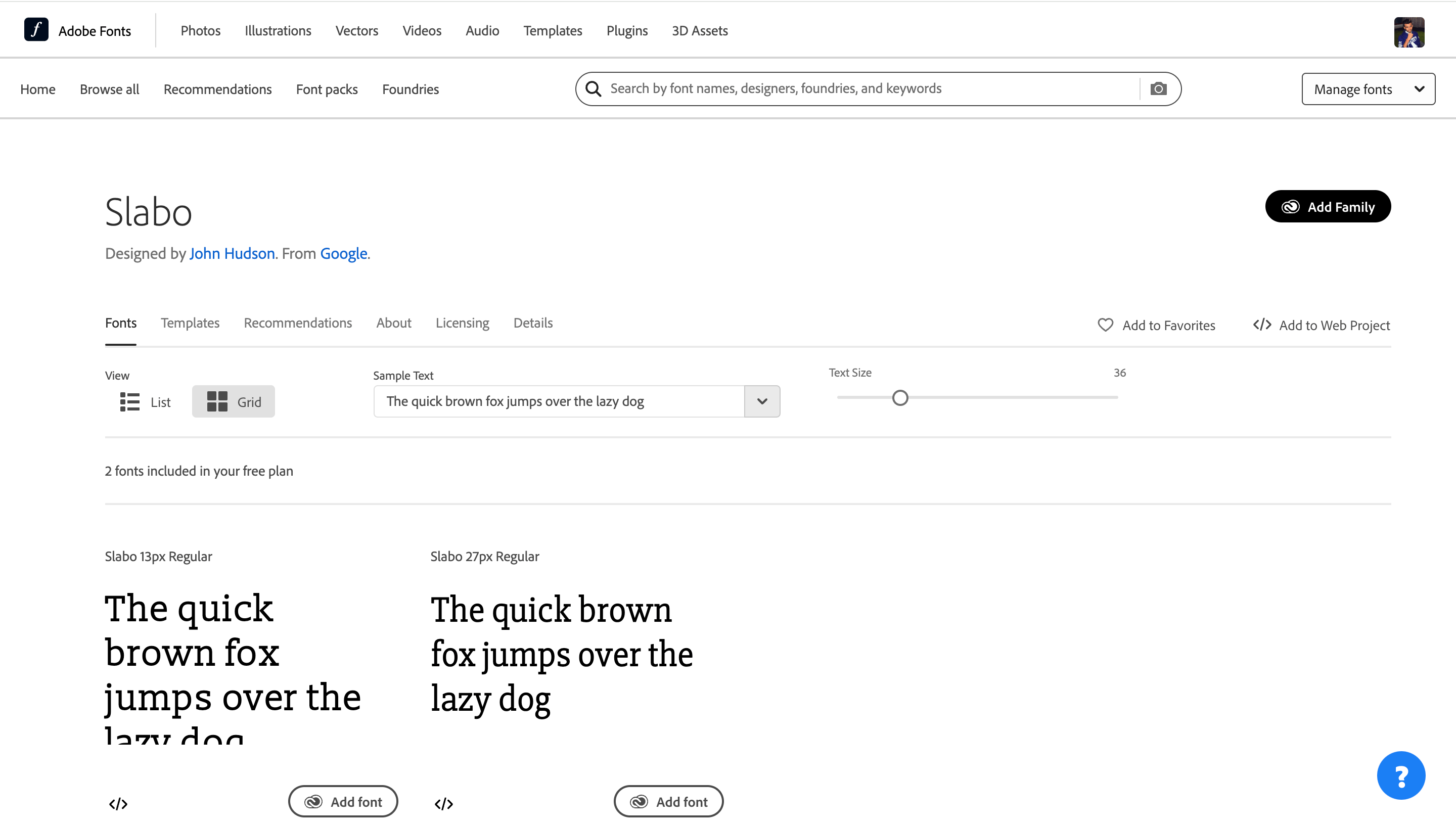
As I have mentioned, I love minimal, but best, this font is one of them. The best thing about this font that I like most is the well-spaced characters having balanced proportions, which helps to increase the clarity of the text. I assure you that using this font in headlines or simple texts will make your text stand out from others.
Like other fonts, this font comes in different weights and styles. You can easily use this font on desktops as well as mobiles. This font is designed in such a way that readers won’t feel stress in their eyes while reading long texts across various devices. Therefore, if you want to target a larger audience, Slabo font could be the best choice for responsive web designs.
Marching ahead, this font supports a wide range of languages, allowing you to use this font in large countries. You can download Slabo for free from Google Fonts, Font Squirrel, Dafont Free, and 1001 Free Fonts.
Highlights:
- Glyphs available for this font include Latin Lowercase, Latin Uppercase, Numbers, Common Latin, Punctuation, and Marks.
- This font supports 400 languages from different countries, including 91 languages from Africa, 131 from America, 59 from Asia, 97 from Europe, and 22 from Oceania.
- This font is mainly used in the United States, followed by Turkey.
- Yorkten Slab Norm Regular and Caecilia LT Pro 55 Roman are the two fonts that look similar to Slabo.
Slabo font can be paired with Trade Gothic Next SR Pro Regular.
11. Baskervville (Free)
If you want to give your blogs an ancient plus modern look, my blogger friend, this font is just made for you. Baskerville font, as old as its style and as stylish as its name, was launched in 1757 in England.
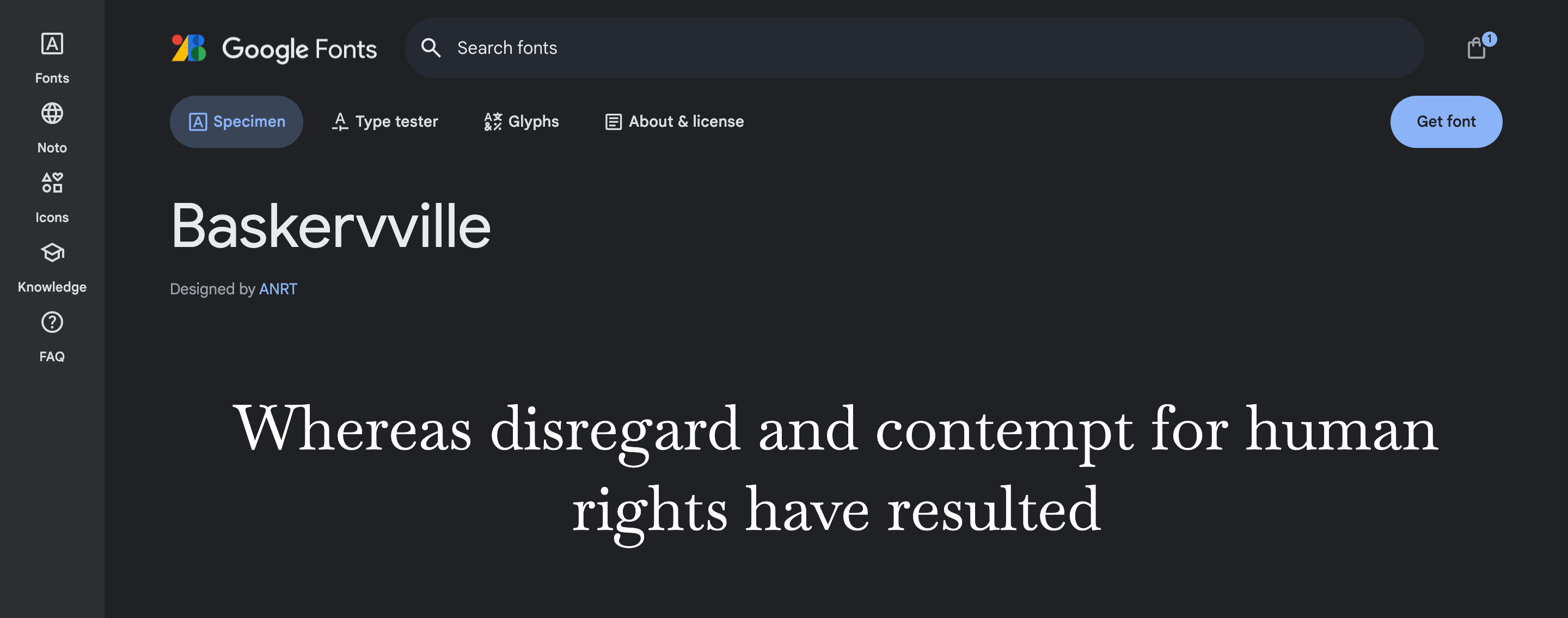
This font serves as a transitional typeface between the old typeface, Caslon, and the modern typeface, Bodoni and Didot. Moreover, it is famous for its wide applications in academics. Most of the books prefer to use this font. This font is considered an excellent choice for Headings as its thick and thin strokes are highly distinguishable, giving this font an effortlessly classic look.
Also, Baskervville letterforms have intricate designs, making them legible even at a more petite size. You can access this font in different weights, from Regular 400 to Regular 400 at 48px, allowing you to choose according to your needs.
Lastly, you can download this font from various sources such as Google Fonts, Cufon Fonts, Free Fonts Family, and DaFont Family.
Highlights:
- Baskervville is a modern adaptation of Jacob’s revival of the classic Baskervville typeface.
- Glyphs available for this font include Latin Lowercase, Latin Uppercase, Numbers, Common Latin, Punctuation, and Marks.
- This font supports 395 languages from different countries, including 86 languages from Africa, 131 from America, 59 from Asia, 96 from Europe, and 23 from Oceania.
- This font is mainly used in the United States, followed by Sweden.
- This font can be paired with Apercu Pro Mono, Lucida Grande, Moderat, Helvetica Neue, Open Sans, Proxima Nova, Frutiger, Avenir Next, and Adelle.
Baskerville font looks similar to fonts like Kepler Std Display, Utopia Std Semibold Display, Operetta 32 Regular, FreightBig Pro Medium Italic, FreightDisp Pro Semibold Italic, and FreightBig Pro Book Italic.
What You Should Look for While Choosing A Font for Your Website
You should consider certain things while choosing a font for your website. These are:
- Always see for what audience you are targeting and accordingly select the font. As it is a well-known fact that every article has a mood, it could be funny, emotional, informative, legal, etc. So, consider the perspective of your writing before selecting the font.
- Each typeface has its perks and losses; some look better in smaller sizes, while some look better in large sizes. Therefore, you should first look for which font is readable and attractive in both dimensions. For example, Roboto is readable in all sizes.
- You should always try that the font you use is legible on both, i.e., big and small screens. This way, you will be able to increase traffic on your site. For example, Slabo is one of the most preferred fonts for both displays.
- Before selecting the font, determine which countries you are targeting. If the font you chose doesn’t support the language you are targeting, then the whole job of selecting the typeface can be failed.
- Designers should ensure they are aware of any licensing restrictions that may be imposed on any typefaces they are considering utilizing. Besides, many typefaces have universal licenses; you can use some fonts only in certain media.
Best Marketplace for Fonts
1. Google Fonts
Google Fonts is one of the most widely used and leading distributors of fonts for free in the market. They have more than 1,000 fonts available in their library that support more than 135 languages.
For me, this is one of the best places to download fonts because it allows me to download fonts for free and provides information about Glyphs, Language Support, the Typeface of the font, and many more. With a large amount of data, you can easily find the perfect typeface for your WordPress blog and stand out from the crowd.
2. Adobe Fonts
Adobe Font was formerly known as Typekit. They provide you with a library of more than 18,000 fonts. If you have an Adobe ID, you can have access to the primary collection of 6,000 fonts.
With such a wide variety in your hand, you can easily choose the best for your WordPress account without compromising quality. One of the significant benefits of using Adobe Fonts is that it can be used online as well as on a Desktop.
3. Envato Elements
Envato Elements is one of my top recommendations for you all, as it promises incredible value. Through Evanto Element, you don’t need to buy fonts individually; instead, you can use a subscription model. Their library is composed of nearly 7,000 fonts.
You can get unlimited access to all fonts you want to download by taking monthly or yearly subscriptions. Not only this, but with their subscription, you get a lot more, like unlimited stock photos, sound effects, WordPress themes, video clips, graphic templates, and many more.
4. FontSpring
Fontspring is also one of the significant websites used to download fonts. This website provides a high range of high-quality premium fonts with over 700 font foundries.
They also allow you to search for a particular font by differentiating category or classification, making it easy for the bloggers to find according to their needs. Their partner foundries include Exljbris, Mark Simonson Studio, Canada Type, Shinntype, and more.
5. MyFonts
This font distributor is one of its type. They allow you to choose from free and paid versions within a font family. They provide you with an extensive range of over 130,000 unique typefaces. These typefaces have 2,000 diverse fonts, giving you an option to choose according to your specific needs.
One more important feature of this distributor is that pricing is based on license and on how many accounts you are going to use this typeface.
6. DaFont
Dafont’s website is widely known for free font download. This website helps you find the font easily according to your project as they have categorized fonts into themes like decorative, futuristic, gothic, handwriting, retro, and many more.
You can also preview the font before downloading it so that you can look for the design you are looking for.
Frequently Asked Questions (FAQs)
1. What are the best fonts to use for a WordPress website?
There are a large number of fonts available on different websites. Choosing the right font can be a task in itself. While choosing a font, try to remember two things: the type of website and the target audience. However, there are some fonts that are evergreen, like Nunito, Open Sans, Montserrat, and Slabo.
2. Are there any free fonts that work well with WordPress?
Of course! Many free fonts are available on Google Fonts, DaFont, and Font Squirrel that can work well with WordPress. Fonts like Open Sans, Lato, Roboto, Slabo, Nunito, Montserrat, Baskerville, and many others are absolutely free and are highly compatible with WordPress accounts.
3. Can I change my WordPress website’s color and font size?
Yes, you can easily change the size and color of your WordPress website by using CSS code or WordPress plugins. Changing the font size and color could be a good option because it can help increase the WordPress blog’s readability and legibility.
Summarizing It!
To conclude, choosing the perfect font for your WordPress can be an overwhelming task. You should keep in mind many things while choosing a font for your WordPress account, like the targeted audience, mood of your article, targeted countries, readability, and font legibility.
If you are unsure of which font you should choose for your blogs, you can always go for Roboto, Lato, Nunito, Open Sans, Montserrat, Poppins, and Oswald. These fonts are highly legible and available for free. You can easily buy these fonts for free from distributors like Google Fonts, MyFonts, and Font Squirrel.
The type of font you choose can impact mainly the traffic on your website. So, I suggest taking proper considerations before choosing a font.
That’s all from my side.
Thank you for being an excellent reader.
Happy Designing!
Great list! These font choices are perfect for anyone looking to improve readability and style on their WordPress site. Thanks for sharing these valuable recommendations!