A great user experience on the website can often mean the difference between engaged consumers and lost business. Slow websites, bad graphics, and lack of mobile responsiveness are some of the factors that negatively affect this equation.
To fix a broken website experience and optimize what’s working, we are sharing some quick tips about the most demanding aspect of any website: its visual content.
Visual content represents the biggest percentage of all content on a given website. Product images, CTA buttons, illustrations, animations, and other graphics take up a lot of server space and affect web performance in one way or another. Visual content is also a tool that improves user engagement on the platform, so this is where you have the biggest opportunity to make impactful changes.
As we go through this article, you’ll learn key strategies that address this issue and help you promote a delightful web experience for all your users.
7 Visual Optimization Tips for the Best Web Experience
According to WebFx sources, 89% of consumers go to your competitor after a poor user experience. Prevent that from happening by utilizing these visual optimization strategies that improve your site’s UX.
Do note that these tips give you an overview of what to do. To implement these and other relevant changes on the website, here’s an in-depth guide to pay attention to.
1. Lead With a Responsive Design
Ensure your website is responsive, meaning it adapts to different screen sizes and devices. This ensures a consistent and user-friendly experience across desktops, tablets, and smartphones.
Remember that responsive design is different than mobile-optimized design. It takes optimization to the next stage and creates a website that fully reformats itself to fit into different screen sizes, dimensions, and orientations.
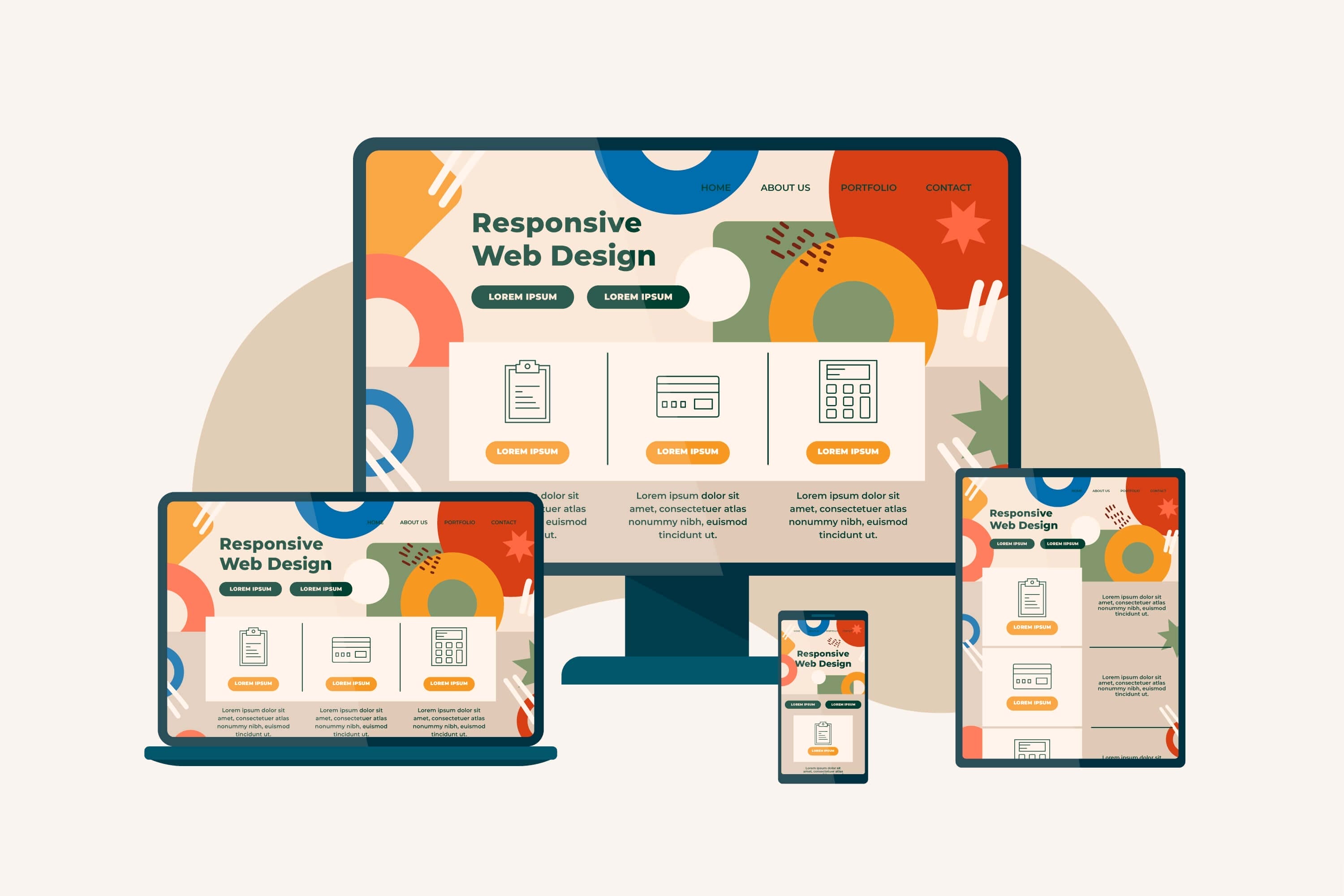
Need to see if a website is responsive? Shrink or expand your browser window and notice if there are any changes. Suppose the graphics on the site become a bit large (and easily clickable with the thumb). In that case, the content modifies its layout to adjust to the screen size, and menus change their formats so they are easy to see on a smaller screen; you are witnessing a responsive design.
Here are some basics for making a responsive web design:
- Prefer vector graphics over raster. Vector graphics use mathematical equations and never lose their image quality. Raster graphics are pixel-based and often lose their way when viewed on screens that are too big or too small.
- Keep your meta tags concise. Short meta titles and meta descriptions are easier to read on mobile devices, so keep those texts to the point for a better web experience.
- Do use dynamic content, but avoid cloaking. Your web users and search engines must see the same content. Where dynamic content prioritizes user needs, cloaking is a black hat SEO strategy that will mean trouble for your website down the line.
- Keep the long-form content to a minimum. Mobile users aren’t going to read long-winded. They’ll typically skim the text. So, add a lot of paragraphs and lists, and keep your sentences short. Create dynamic versions of your long-form content for a better user experience and search rankings.
- Avoid large pop-ups that cover the entire screen. Let your users engage with your content and not be driven away by an annoying ad pop-up that takes over the full screen of the mobile.
Remember that while mobile-friendly and mobile-optimized websites are an option, a responsive website offers the best web experience you can imagine. Plus, if you start with a responsive design from the word go, you save a lot on costs and production efforts later on.
2. Optimize Images
While users like to see large, glossy images on screen, those assets take up a lot of space on the servers and contribute astronomically to the website load time. Optimize your images by compressing them, which reduces the file size without losing quality. This encourages faster loading of pages and promotes the efficiency of the website.

Consider using next-gen image formats like WebP for better compression.
Here are some more best practices to implement:
- Choose the correct file format. The most common file formats are JPEG, PNG, GIF, SVG, and the latest, WebP. JPEGs are the lightest, but you may lose quality every time you compress them. PNGs support higher-quality images but may be heavier to load. Kinsta recently did a pretty neat rundown of the major image formats out there and when to use each. Take a look.
- Consider serving images via CDN. Content delivery networks are networks of servers spread out geographically. When you place your images on those servers, it improves page load speed as HTTP requests are fulfilled by the servers nearest to the user.
- Use descriptive file names and add alt text. Search engines need to know what your image files are all about. Using descriptive file names such as ‘dog-being-funny’ is more understandable than 20230214-dog-1.jpg. Also, use alt text when uploading any imagery. Alternative text describes the image and helps search bots and assistive tools (for users with a disability) to understand your visual content.
- Practice contextualized image placement within the content. Choose images or create images from text using AI tools that are relevant to the content on the page, and place them according to their relevancy. If you are talking about some statistics in paragraph 2 but insert the corresponding graphic three paragraphs later, it will mess up the UX.
- Use copyright-free images of the highest quality. Never use graphics where the copyrights are doubtful. Use services like Canva or Unsplash to source royalty-free, hi-res images for most of your visual media needs.
- Make your visuals accessible with captions and transcripts. Add captions and transcripts to your video content. It improves accessibility and also gives you untapped opportunities to add keywords that could help you rank.
Most importantly, regularly evaluate and update your visuals to ensure they are updated and properly displayed on pages with the correct captions and alt text.
3. Optimize Video Content
Videos are the fastest-growing content type across industries and target markets. Mobile users especially consume a lot of video content and even use branded videos to make purchases, learn more about products, and share the things they like.
Optimizing your video content will improve user engagement on the website and may also boost your SERP positioning for the most relevant keywords.

Here are a few things you can do to boost that:
- Choose a widely supported video format. Formats that are compatible with various devices and across browsers include MP4 or WebM. Using an outdated format will create playback issues for your users.
- Use high-quality videos. Balance quality with file size to ensure there are no viewing hurdles or slower load times. Sharp and clear videos improve the viewing experience and motivate users to spend more time on the website.
- Consider reputable platforms to host your videos. These include YouTube, Vimeo, and Wistia, etc. You can publish your videos there and then embed them into your content for a frictionless viewing experience that doesn’t put a burden on your load speed and optimizes your web experience. These platforms also offer additional features like analytics, which you can use to monitor and fix your content performance.
- Include video transcripts. Captions help turn dialogues and sounds in the video to be presented in the text format. They are time-based and change as narration/sounds change. Transcripts are your entire video content presented in the text format under the video. Both these features are priceless when it comes to making content accessible to viewers. Captions and transcripts also improve SERP rankings as they contain your targeted keywords in the content.
To read in more detail about how to optimize your site’s video content, here’s a great read.
4. Implement Lazy Loading
Lazy loading is a multidimensional technique that protects your positive web experience from several different angles. Lazy loading refers to deferential loading of images and other content on the website by prioritizing the loading of content that’s in the user’s view. The rest of the content only loads when the user scrolls down to it.
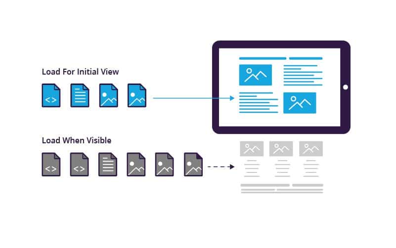
On the one hand, lazy loading reduces the initial load time, keeping users staying on the website. On the other, it saves your precious data usage as heavy images and other content only load when necessary.
By delaying the loading of non-essential web elements, you can focus your site’s resources on what the user is interacting with. This means cleaner and sharper images with no initial pixelation and the impression of a fast and efficient website that users can trust.
Websites that are content-heavy or that have a lot of product inventory on their pages can especially benefit from the huge improvement in page load time brought on by lazy loading.
5. Leverage Browser Caching
When you visit a website for the first time, your browser downloads the site data from its server. Some of that data, such as static images, are stored on the browser so revisiting users enjoy a faster loading time where the process doesn’t have to start from scratch.

For a streamlined web experience focused on visual asset optimization, browser caching works as an indirect tool. Unlike image compression or choosing the right file formats, that improve your visuals directly, it addresses the issue by managing the loading of assets.
By displaying stored images instantly, it conveys the impression of quick loading. Combined with a well-designed website, it results in user behavior that prolongs website visits, increases repeat consumers, and directly improves site traffic.
Note that site managers can put a limit to the duration the data is stored on user browsers. After that time has passed, say a year, and the user hasn’t returned to the site, the cache would be cleared. It’s done so sites don’t slow down user browsers which can also be a reason for lethargic digital experiences.
6. Optimize Your Website Fonts
Website fonts have a direct impact on your website performance. Fonts that load poorly or slowly tarnish a good web experience, both in terms of speed and legibility.
The single most important job for fonts on your website is to make your content easy to read. Badly rendered fonts can make that task difficult to accomplish. So, what do you do?
- Use web-safe fonts whenever possible; and
- Limit the number of fonts and their varying weights and styles you use on the website.

The more styles or weights you use on the website, the more font data it’ll require the server to deliver. It not only eats into the bandwidth but affects the site aesthetics too, not to mention messes up the hierarchy of the fonts, creating text that’s hard to skim or read.
A minimalist typography system optimized for the website ensures a good hierarchy where you’re only moving between two or three styles of font. One for titles, one for headings, and another for the body. Anything more and you run the risk of disrupting your users’ experience of your site.
Talking about web-safe fonts to use, you have several options to consider. There are system fonts that come preloaded on a user’s device. The #1 pro of using them is quick loading as they are already there on the user’s system. We also have third-party fonts that are downloaded from the internet. They may slow down the speed but give your brand high distinction value by giving you more font design choices to explore. Google fonts are a popular example.
Then we have custom web fonts. Custom fonts allow you to be more expressive through your typeface choices and give your brand greater visibility in a competing environment. But that comes at a performance cost. Custom fonts can bloat up a site. While you can try to address that by using fewer weights and styles, what helps is using a font file format that all the major browsers support. We’re, of course, talking about WOFF2.
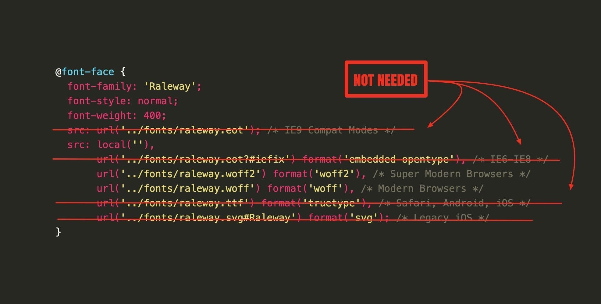
It offers lossless compression to your font files and improves the site experience. Visually, too, it helps you cut through the noise without any downsides.
To make it even more failsafe, techniques like FOUT, FOIT, and FOFT are on the table. Their essential differences aside, they all function on the same principle: render the text in a fallback font that’s already available on the system until the custom fonts are loaded. Though it does mean that the site text changes font appearance for a few seconds, the upside is better load times.
Go through the article to understand which balance of the equation you can work with, and which of these techniques are closest to your end goal.
7. Minimize the Use of Animations
We all love good animation. When images start moving, they begin telling us richer stories and create more engaging experiences. But like all good things, too much of animations is also bad. For one, it takes away the delight that’s present in rareness, and for another, it makes your site excruciatingly slow to load. Even to the point that people might give up and go back to the search page.
A large animation in the GIF format can often weigh more than a video and creates slow-loading websites. Optimizing your site animations allows you to strike a balance where you can continue delighting your users with motion graphics without frustrating them with sluggish online experiences.
Lastly, Monitor Performance
By following these tips, you can enhance the visual optimization of your website, providing a better user experience and potentially improving your site’s search engine rankings
Tools like Google PageSpeed Insights, Lighthouse, or GTmetrix can allow you to monitor how your site is performing, the role visuals are playing in the site performance, and get suggestions on how to improve that balance.
Additionally, consider using Session Replay Software like Hotjar or FullStory. These tools record real user sessions, letting you see exactly how visitors interact with your website. By analyzing this behavior—such as where users click, scroll, or drop off—you can identify UX issues, optimize visual elements, and ensure your responsive design is functioning as intended across devices.

Very informative article. I particularly found value in the tips regarding visual content optimization. It’s interesting how small changes to images and videos can greatly enhance user experience. Thanks for sharing such valuable insights!
Great tips on visual content optimization! The connection between an engaging website and optimized visuals is profound. Your suggestions about responsive designs, image optimization and video content are very practical and beneficial. Thanks for this enlightening article!
Great points! Visual content can make or break user experience, especially when it comes to site speed and engagement. Optimizing images and graphics without compromising quality is key. Do you have a preferred method or tool for balancing performance and visual appeal?