What first comes to your mind when you hear terms like ‘color’ and ‘contrast’? Is any of these thoughts anywhere around the term ‘Accessibility’? If not, then don’t worry; you are not alone! However, you should know that color and contrast play an immense role in making your website more accessible to visitors.
The main objective when building a website is to use beautiful designs that attract customers. Likewise, the colors used in a website play an important role in attracting visitors. No matter how much time you invest in making your site quick to load, or writing engaging content, if your website has poor visuals, you will be unable to reap the seeds of your hard work.
While the other factors are equally important, you cannot ignore the importance of accessibility and easy navigation on your site. This way, you can ensure that visitors return to your website. However, that does not mean you use any color palette, as a random selection of color palettes will harm your site. For example, using colors with high contrast can make it difficult for your visitors to read the content and lead to eye problems.
Also, it might ruin your site’s rankings on the SERPs and lower your position on the User Experience Index. However, knowing which color contrast to choose, it is essential to understand what color contrast is and how to leverage it to your advantage.
What is Color Contrast? Why is it Important?

The difference in hue and brightness between two colors is referred to as color contrast. It impacts your website’s readability, accessibility, and user experience, making it a crucial component of design for your website (You can check the color contrast of your website using online color contrast checker tools).
People who are color blind or have visual impairments may find it difficult to read a website with poor color contrast and may find it challenging to navigate and interact with your site.
Also, color contrast is crucial for website text components, such as headlines, body text, and links. Users may find it challenging to read the text if there needs to be more contrast between the colors of the text and the background.

Color contrast also affects the website’s visual hierarchy. By using contrasting colors for buttons and calls to action, designers may draw attention to the website’s most important elements and make it easier to navigate.
You may enhance user experience and increase the accessibility of your information for a broader prospect of people by ensuring that your website has enough color contrast.
An Insight Into Color Contrast Ratio
Color contrast ratio is a number that shows how different two colors are in brightness. On a range of 1:1, which means no contrast to 21:1, which is the highest degree of contrast, the contrast of the colors is evaluated. The contrast ratio is then calculated by comparing the brightness of the color in the center to the brightness in the background.
The Web Content Accessibility Guidelines (WCAG) say that regular text and pictures of text should have a contrast ratio of a minimum of 4.5:1. This makes sure that people with poor vision, color blindness, and other eye problems can read the words easily.
Also, there are some government standards that your website must meet. One of the most essential standards is “Title III of the Americans with Disabilities Act.” It states that the websites must be “ADA-Compliant.” Now, you must be wondering what these terms mean. And the term “ADA-compliant” refers to whether a website conforms to the accessibility standards set forth by the Americans with Disabilities Act (ADA).
Distinction Between Good Contrast and Bad Contrast

Good contrast in web design refers to sufficient visual differentiation between the foreground (text or images) and the background. This facilitates easy reading and reduces eye strain.
Bad contrast, on the other hand, indicates that the foreground and background lack sufficient distinction, making the content difficult to comprehend and possibly causing distress or damage to some users.
Here are some examples of the distinctions between excellent and poor contrast:
Readability of Text
Text with excellent contrast is simple to read, especially in dimly lit areas. Since the text stands out from the background with good contrast, it is simple to tell apart individual characters. Check this out to know how to easily change the font color on your site.
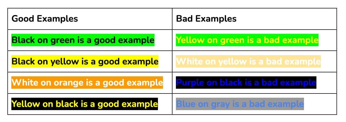
Conversely, poor contrast makes it challenging to see text and may result in eye strain or headaches. The below image is an example of poor contrast text.

Color Choice
Employing separate foreground and background colors, such as purple text on a white backdrop, indicates good contrast in color choice. Light gray writing on a white backdrop or red lettering on a green background are examples of poor color contrast. These combinations cause eye strain and headaches, making it difficult to read the letters. Below is an example of good vs bad color choices.
Accessibility
For users with impaired vision or color blindness, good contrast is a crucial aspect of online accessibility. Poor contrast makes it tricky or impossible for some users to tell the difference between the foreground and background, which makes reading the information difficult or impossible.

Design and Branding
Effective contrast is essential for both. A well-designed website will make critical features, such as calls to action or navigation menus, stand out using contrasting colors. A website with poor contrast may seem amateurish or challenging to use. Remember this when creating the design of your website and converting it into code. If necessary, consult professionals who will assist you with color choice and design conversion from PSD to HTML.
Overall, a website’s effectiveness and accessibility rely heavily on contrast. By ensuring that the foreground and background have sufficient contrast, users can read and navigate the content with ease, resulting in an improved user experience.
How do I Know I have Chosen the Optimal Color Contrast?
Good contrast in color selection means that the foreground and background colors are distinct, such as black text on a white background.
Bad color contrast could include pale gray text on a white background or scarlet text on a green background. These color combinations make distinguishing the foreground from the background difficult, causing eye strain and migraines.
It may be challenging to determine if a website has a color contrast problem since what one person finds easy to read may be difficult for another. According to the WCAG, the smaller text should have a contrast ratio of a minimum of 3:1.
In contrast, standard text and pictures should have one of at least 4.5:1.
You must also read about the psychology of colors to choose the right color combinations for your site. Logotypes do not have a contrast requirement for any text incorporated in the logo, nor do they need contrasting colors for text or pictures that are solely ornamental or include other visual content.
Tools to Check Your Website’s Color Contrast Ratio

Below mentioned are some tools that can be used to check your website’s color contrast ratio.
1. User Way
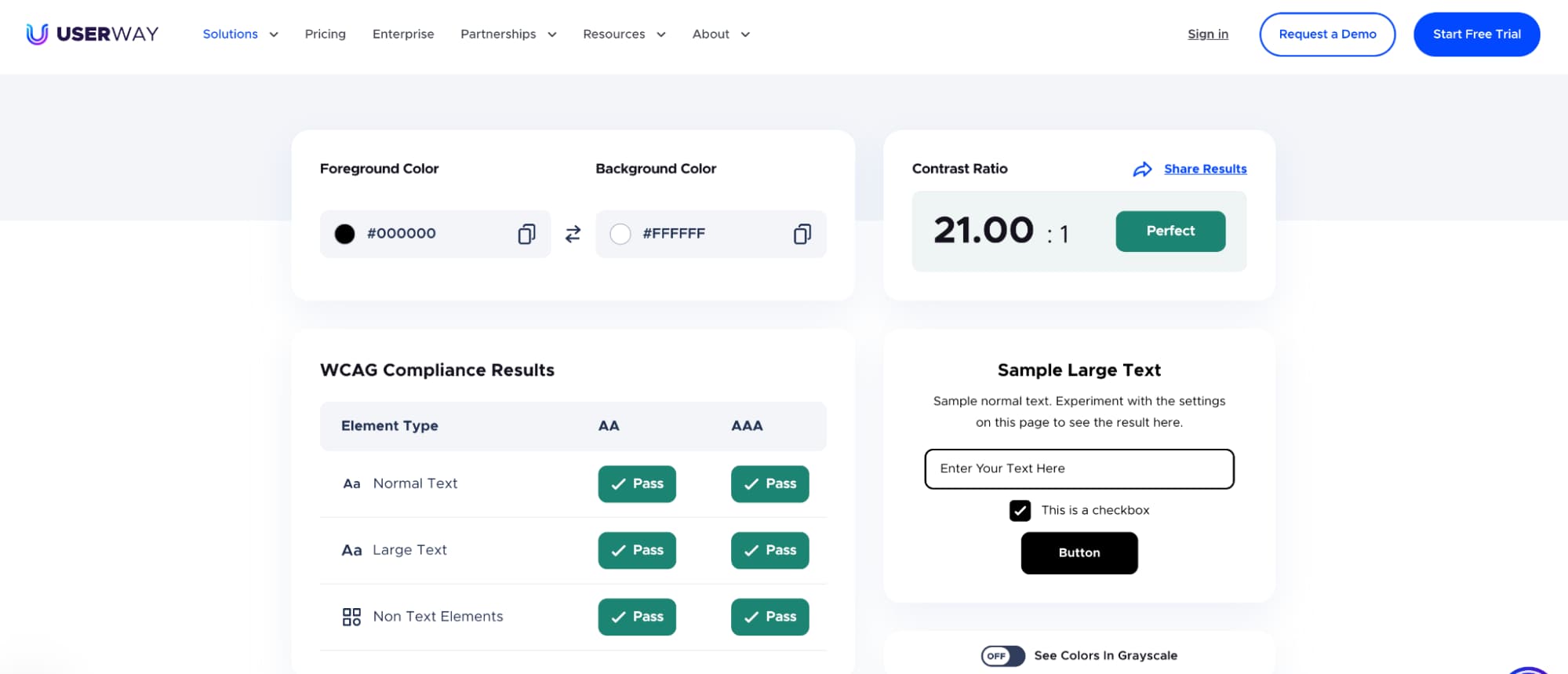
User Way is a free tool that assists designers in checking whether their website design is compliant with WCAG standards. You can provide your foreground and background colors, and then the tool will check against a few criteria and then display the results. This is an amazing tool that makes it easy to increase the accessibility of the website.
2. Contrast
It is an app that will help you gauge the color contrast ratio of the various elements used in your website. It will also check whether the design complies with the Web Content Accessibility Guidelines (WCAG). It also provides insight into what your web design seems lacking and how you can improve it.
3. Color Safe
If you do not wish to download any app, this in-browser tool will come in handy for you. With this tool, you can generate color palettes that comply with the WCAG standards. All you are required to do is enter the color gradients used on your site, and this tool will tell you if it meets the guidelines.
4. Tanaguru Contrast-Finder
It is an easy-to-use tool where all you need to do is enter your desired color palette, and it will generate the contrast ratio of your site. Also, it will generate some of the best color palettes that meet WCAG requirements based on your preferences, and you can choose one as per your requirements.
5. Stark
Stark is a plugin for Adobe XD, Figma, and Sketch that provides designers with tools to promote inclusive and accessible design standards within their existing software.
Among the tools Stark provides is a contrast analyzer that lets designers determine whether their typography, font size, design elements, background colors, or supporting visuals satisfy the required legibility and contrast standards established by accessibility guidelines.
You can use any of these tools to gauge the contrast ratio of your site and whether it meets the WCAG standards. Some of these tools also provide alternative color palette options that meet the standards. You can choose any of them that matches your needs.
Frequently Asked Questions (FAQs)
Below mentioned are some commonly asked questions:
Q. Can you Give an Example of a Contrast between Colors?
White text on a black background is an example of high color contrast. Yellow on white background, on the other hand, is an example of low color contrast.
Q. What is the Difference between Color and Contrast?
The difference between color and contrast is that contrast is about how different or similar two colors are. High-contrast colors make reading the text and the background easy, while low-contrast colors make it hard to read the words.
Conclusion
The color contrast used on your website plays an important role in determining how accessible it is for people with visual impairments. Also, if visitors find such text that they are unable to read, they may quickly move to your competitor’s website. Thus, you must choose the right color contrast. Also, you must ensure that you meet the WCAG compliance regulations.
High-contrast color palettes make it easier to read the text on your site. However, remember not to use high-contrast foreground with high-contrast background colors. Also, you can use online tools to ensure your website’s color contrast is compliant with WCAG guidelines and is accessible to all visitors.
We understand making an accessible website takes a lot of time and hard work, but it’s all worth it in the end.
Your detailed guide about color contrast in website design is enlightening. It emphasizes the importance of accessibility in web development. The tools for checking color contrast ratio on a website seem quite helpful. Great work!
This article provides valuable insights on the importance of color contrast and accessibility in web design. The tools recommended to check color contrast ratio are very helpful. Your explanation on color psychology will definitely guide web designers to make more informed choices.
Your article on color contrast and website accessibility is truly enlightening. I was unaware of how essential contrast is for visitors with visual impairments. The provided tools for checking contrast ratio seem very useful. Great job!